About
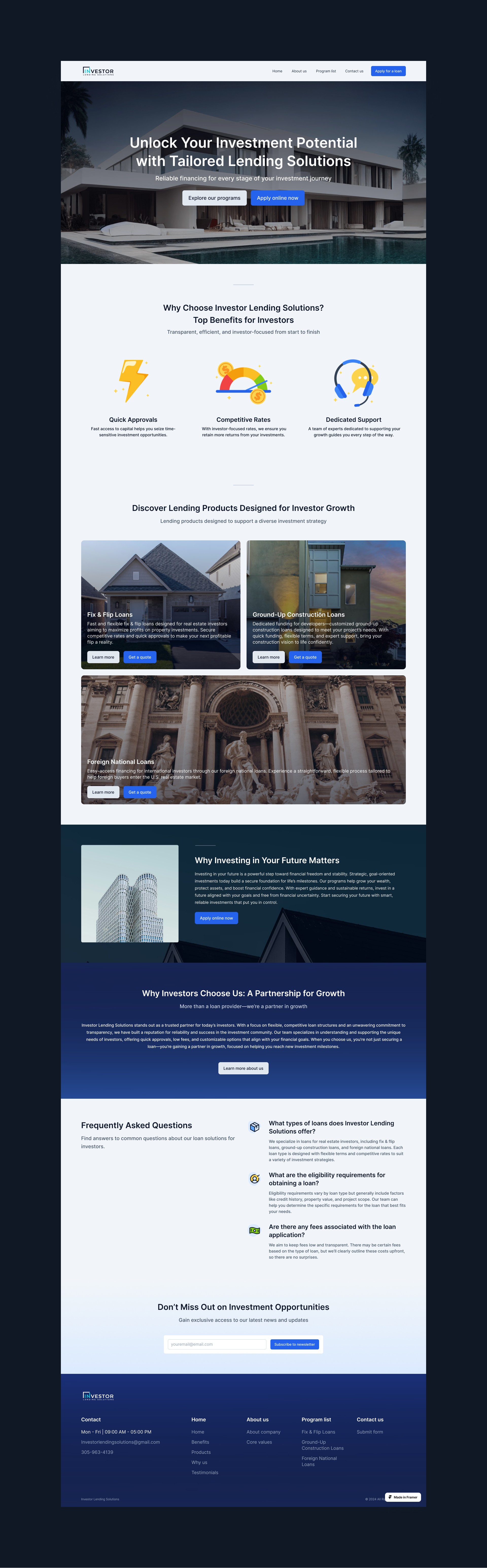
This project was a great exercise in clean, conversion-focused design. With Framer as the base, I focused on building trust from the hero section down. Lending can be intimidating, so I avoided dark patterns or overly salesy design. Instead, I used straightforward CTAs, testimonial-style validation, and minimal scroll friction to keep users on track. Working with this US-based client also pushed me to consider tone and user psychology across different markets.
Check out the site here.
Building a Smart Application Form Inside Framer’s Limits
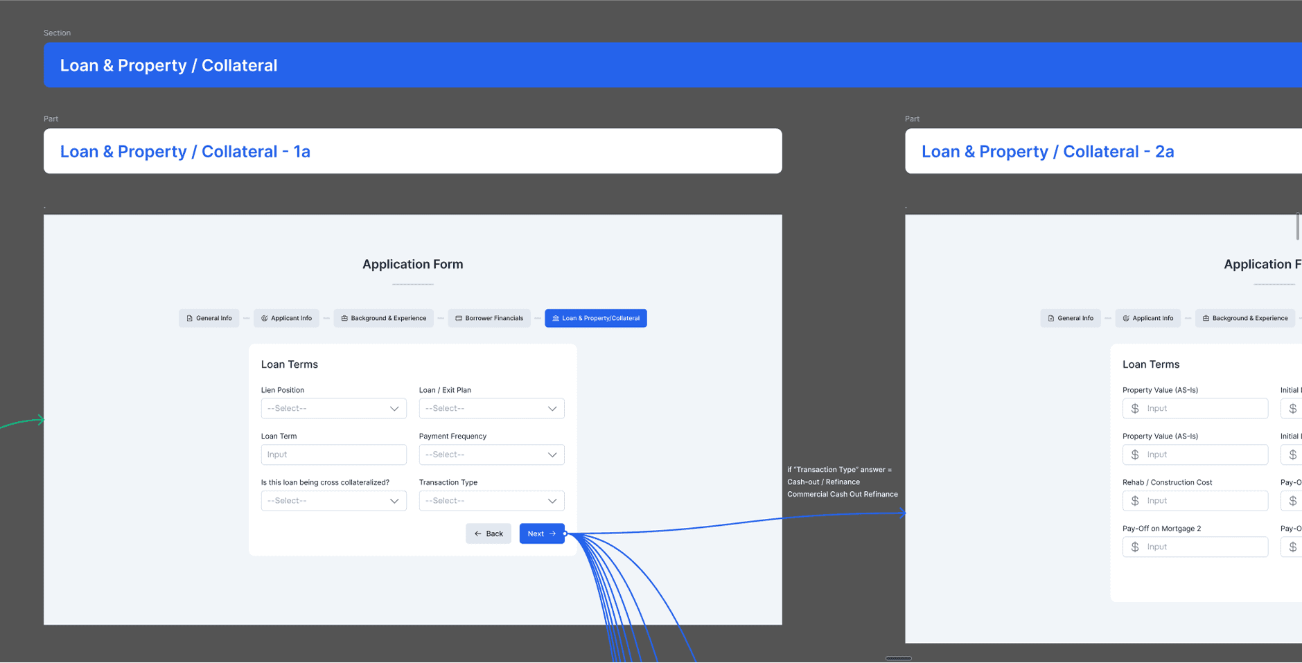
When working on Investor Lending Solutions, one of the most unique challenges I faced was creating a complex, adaptive application form using Framer—a tool that doesn't fully support conditional form logic by default.
The client asked for a multi-step form where the next section would change depending on the user's earlier answers. For example, if someone chose option A in the first step, the following section should show X; if they chose option B, it should show Y. The behavior needed to happen instantly, just like the real-time forms found on similar lending sites the client referenced.
I began by visiting the competitor websites they sent and analyzing how their forms worked. Most of these forms were custom-coded, which meant they weren’t built using no-code platforms like Framer. While those sites delivered a fluid experience, they often looked cluttered and hard to follow. Still, they offered helpful examples of adaptive form behavior—something I aimed to replicate in a cleaner, more organized way.
The next step was figuring out how to bring this into Framer. I broke the problem into smaller questions and discussed it with my team:
Are there any existing Framer components that support conditional logic?
If not, can we add custom code to make it work?
If both options fail, could we use a third-party solution or even a Google Form?
Luckily, we found a Framer component that allowed limited conditional logic—but with one key restriction: changes wouldn’t show immediately based on user selection. The form still needed a “Next” button to trigger changes between stages.
Even with this limitation, I moved forward. I started by mapping out all possible user flows, identifying what information was required at each step, and how the form should adapt. This detailed planning phase made the actual building process much smoother.
After building and linking everything in Framer, I handed the prototype to my team and the client for testing. Thanks to the clear structure and mapped scenarios, only minor changes were needed. In the end, the form worked well, matched the business goals, and fit cleanly within Framer’s current capabilities.
This project taught me how to work creatively within constraints and how important structured thinking is—especially when using tools that don’t offer full flexibility out of the box.
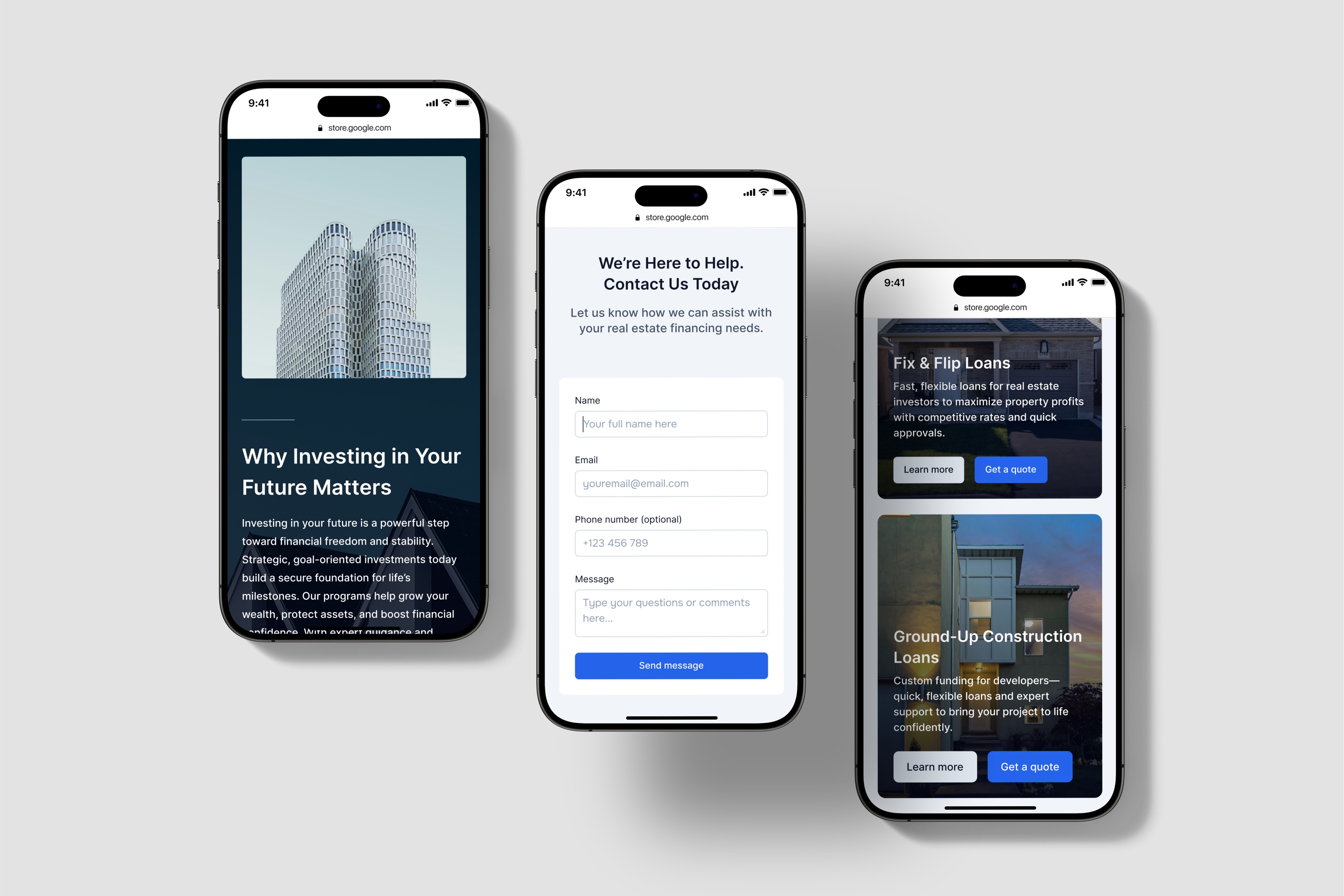
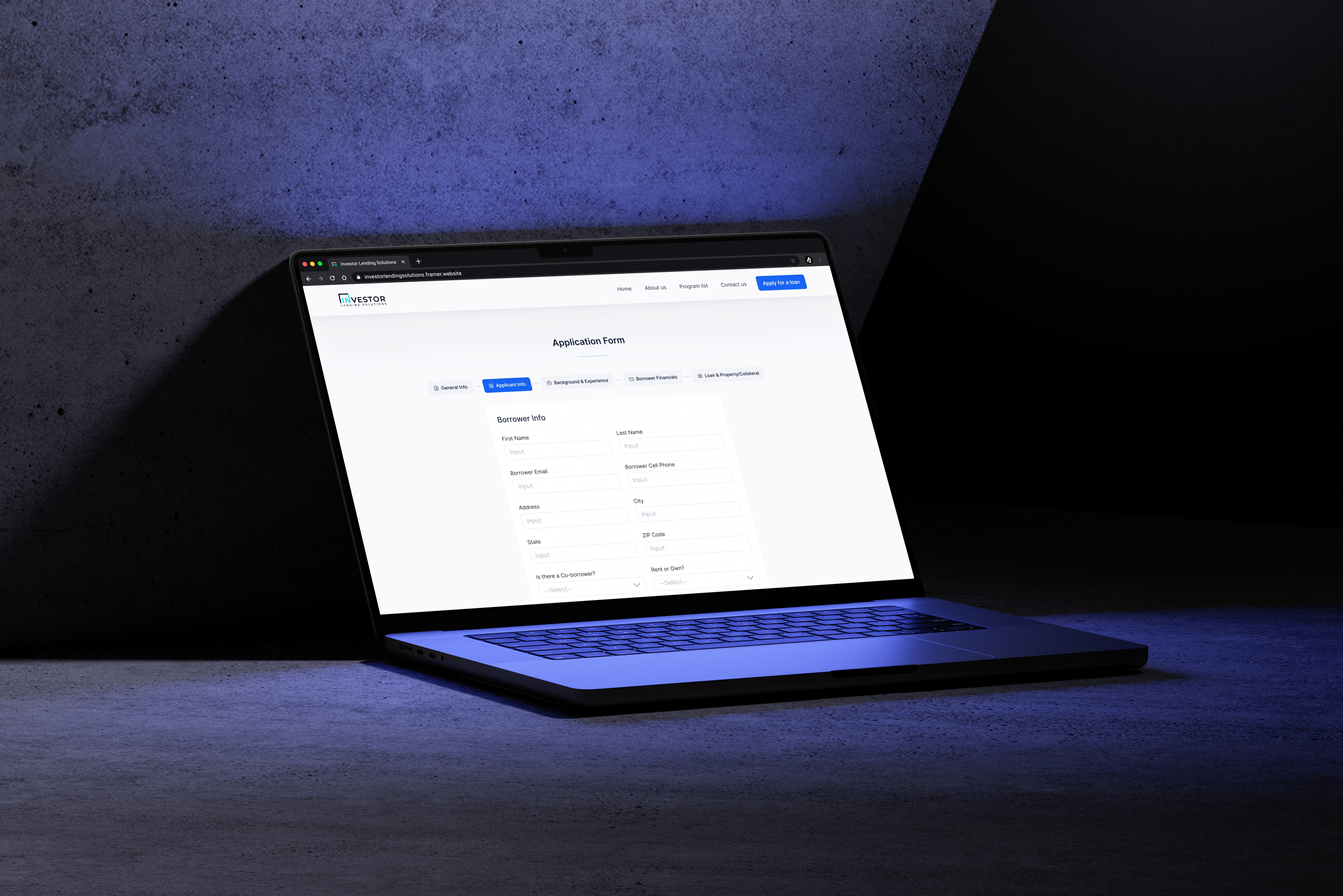
Here are some screenshots of the design: